How might we provide better access to services for older adults?
AskWyse is a small startup with a mission to bring better access to services for older adults.
My role at AskWyse as the sole product designer was to develop the UX/UI for the website, manage user research and usability testing, develop brand language and marketing materials for print and digital advertising campaigns and participate in business strategy discussions based on user feedback.
AskWyse users are both business and individuals. It was important that we understood both in order to launch a successful product.
Care Plan
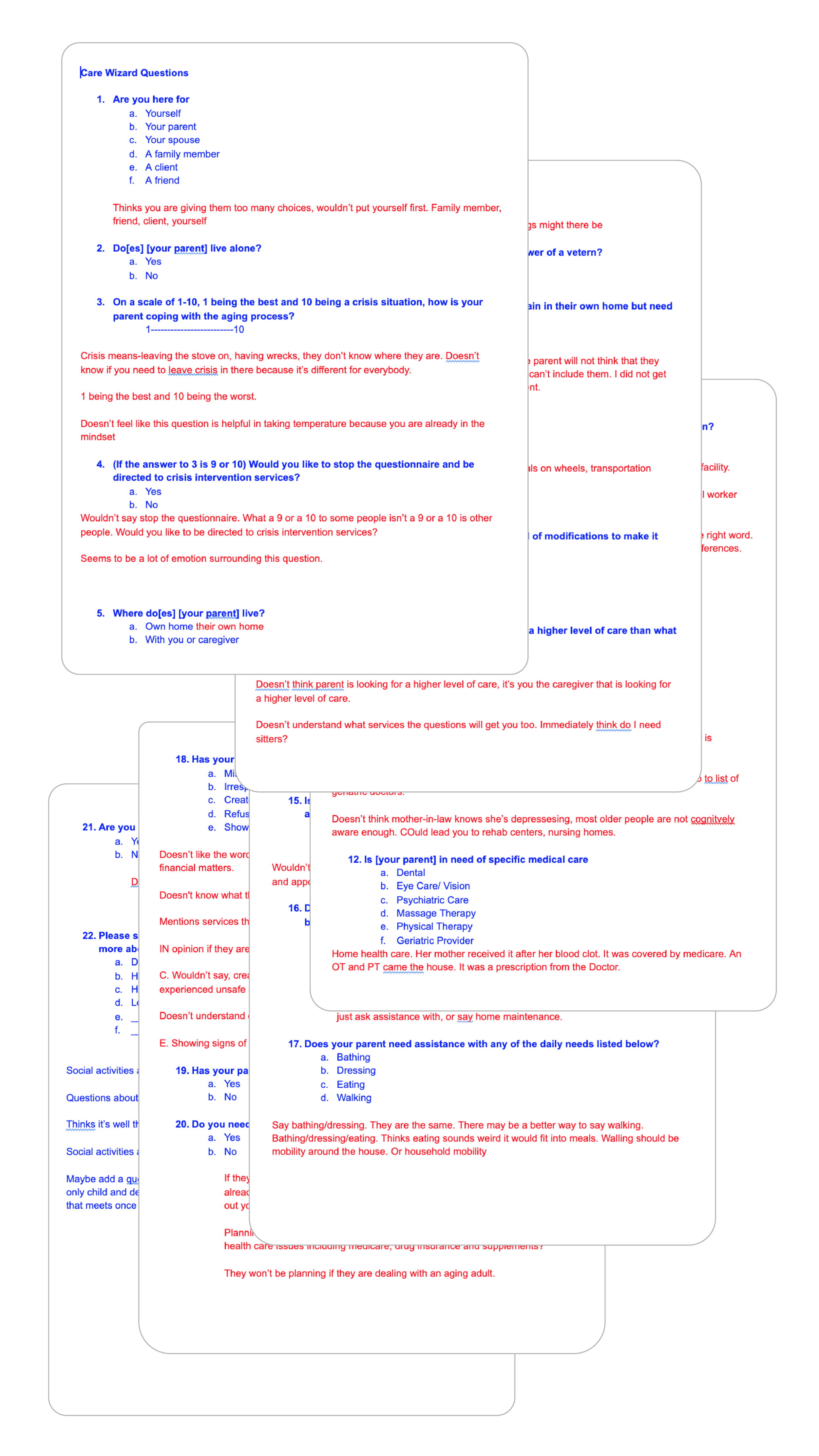
The Care Plan feature is meant to help users receive a personalized list of services by walking them through a series of questions in targeted categories.
Writing the Care Plan
Starting with assessment questionnaires given by geriatric care managers, I created a rough draft of the care plan that I could test with. Through user interviews, secondary research and testing questions on geriatric care managers and individuals who would potentially use the feature, I arrived at comprehensive set of questions to move into prototyping.
Building the Care Plan
I began building the Care Plan with accessibility, privacy and engagement in mind:
Users needed to be able easily read and understand why they were answering these questions.
The questions had to create a relevant list of results while using a familiar tone that didn’t feel like it was invading a vulnerable user’s security.
The users needed to stay engaged. At 20 questions, the care plan is long. I brainstormed various progress icons and we decided on an icon guide system to help the users understand the category of the questions along with their location in the questionnaire.
Waiting to Launch: In the current version of the Care Plan I focused on accessibility, bold fonts, clearly defined buttons and CTAs. As we launch this feature I anticipate an evolving development process to create questions that funnel users into a usable results page.
Search: What services can we help you find?
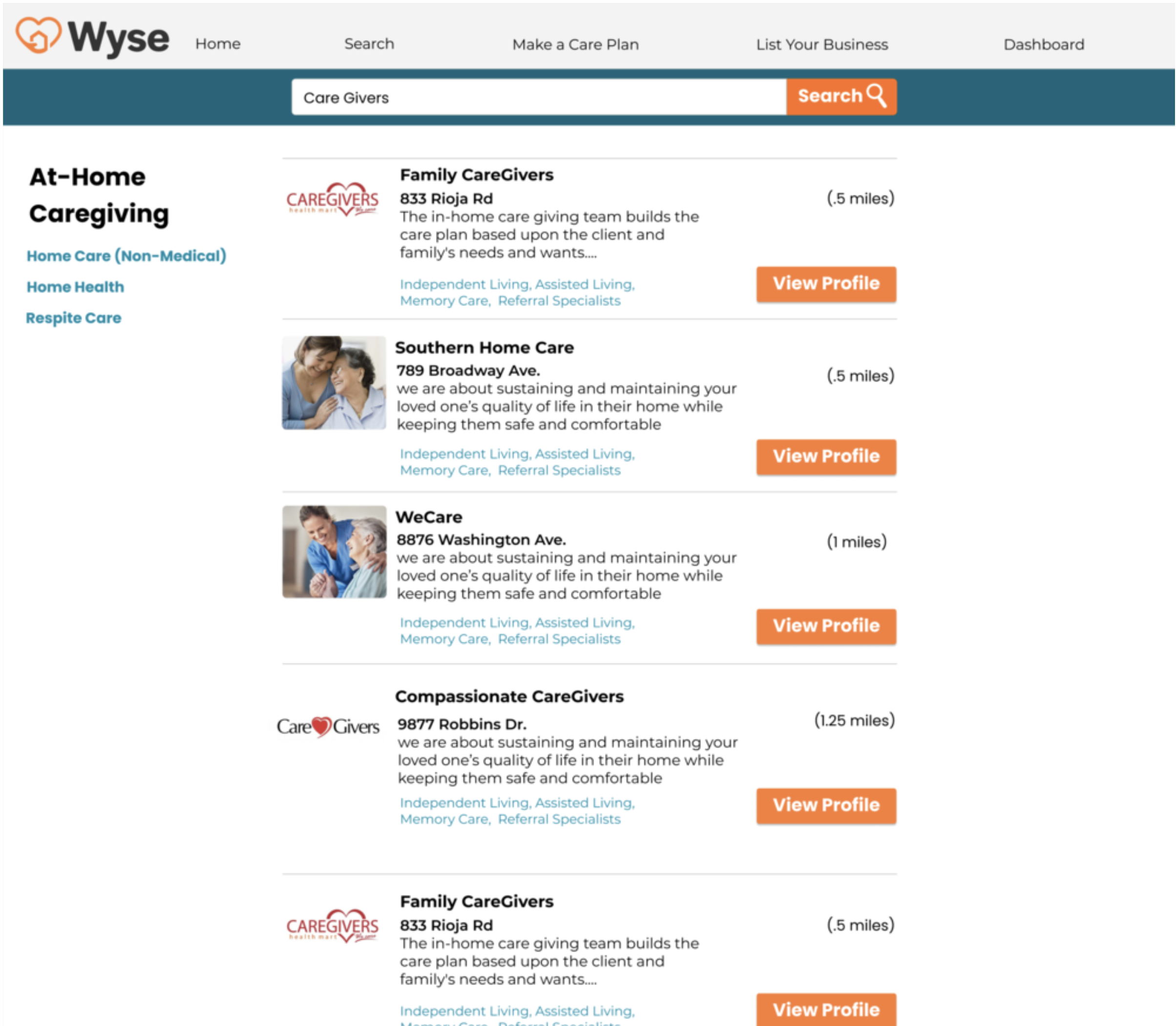
The goal of search is to allow for users to search for vendor profiles grouped into categories based on the service they provide. We wanted users to view all the listings within a category and be able to easily connect to related categories. It was also important navigation provide bold, clear direction on the next step. Some feedback we received in interviews is that older adults are inclined to give up easily once they are stuck. Our goal was to always take this into consideration and provide clear direction on each page.
Accessibility
Although I thought the teal and orange created a better brand color story, once I had everything mocked up I knew it was too difficult to read. I realized the the brand story had to be accessibility in order for our product to succeed. I selected a web accessible color that clearly highlighted every element on the page that was a clickable word and stood in direct contract to the orange CTAs.
Teal is hard to read when you squint your eyes. .
Blue is more accessible on white background, moving the buttons to the left and enlarging them encourages click through rate.
Business Profile Page
I built a profile that followed industry standards so as not to be confusing to any new users to the site. All the information is laid out in an easy to read outline format that allows users to scan the page and quickly find the information they want. .
Vendor Onboarding
In order for vendors to easily navigate the on-boarding process for mobile and desktop, we built two different user flows. Desktop allows the user to fill out a scrolling form while mobile allows the user to go screen by screen through a wizard. Based on feedback, we felt that desktop was going to be the most used access point for vendor signup.
In building vendor onboarding we had to make sure we captured users by giving them the enough information without causing cognitive overload. I tested out the vendor flow with a range of potential customers including geriatric care mangers, occupational therapist, and assisted living community directors. Each user gave me a valuable perspective on how they would view this process.


